


How to Create a Beautiful Living Room with a Color Scheme
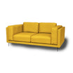
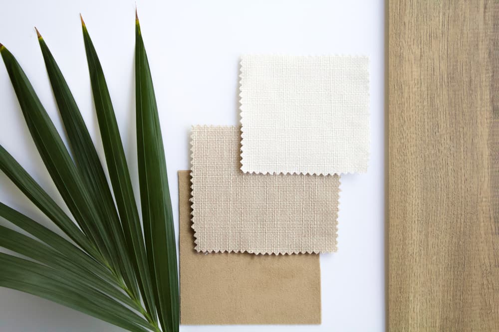
A color scheme is an important part of your living room’s interior. It can help create a harmonious and attractive design. Before you start choosing a color scheme, it’s helpful to collect swatches of fabrics and other materials you want to use in your living room. This way, you can easily see how the colors match each other. There are different ways to choose a color scheme. A popular option is to use a monochrome scheme, where you use one color in various shades. This can be done with soft pastel tones for a calm and serene effect, or with bright colors for a bold and energetic look. You can also choose a color scheme with complementary colors, such as blue and orange or red and green. This creates a lively and exciting effect in your living room. If you’re looking for living room ideas, you can also look at the furniture and accessories you already have. Try to combine these with a color scheme that suits them. For example, if you have an IKEA sofa with blue fabric, you can find accessories and decorations in matching blue shades.


Complementary Colors
Complementary colors are colors that are opposite each other on the color wheel. They create an exciting and lively effect in your interior and can be a great way to brighten up your living room. There are different ways to use complementary colors in your living room. A popular option is to use them in fabrics and accessories, such as cushions and throws. For example, you can combine a sofa with orange fabric with blue cushions and a green throw. This creates a lively and visually appealing effect. You can also use complementary colors on walls or furniture. For example, if you have an IKEA cabinet in blue, you can paint the walls in an orange shade. This will create a unique and striking effect in your living room. It’s important to remember that you don’t have to overdo it with complementary colors. It’s better to alternate them with neutral colors, such as white or gray, to maintain a harmonious effect. Above all, find what suits you and what you like! If you’re looking for living room ideas with complementary colors, you can also look at photos and examples online or in design books for inspiration. This way, you can see how others have used complementary colors in their interiors and what works for you. Try different options and go for what you find most beautiful!
Quality Contrast (ton sur ton)
Quality contrast, also called ton sur ton, is a way to use colors in an interior by using different shades of the same color. This can give a subtle and harmonious effect to your living room. You can apply quality contrast in fabrics and accessories, such as cushions and throws, or on walls and furniture. For example, you can combine a sofa with beige fabric with cushions in various shades of beige and a throw in a darker beige tone. Or you might have an IKEA cabinet in blue and paint the walls in a lighter blue shade. It’s important to remember that using quality contrast doesn’t mean you have to use only the same color. You can also add other colors to enhance the effect or to vary it. Above all, find what suits you and what you like! If you’re looking for living room ideas with quality contrast, you can also look at photos and examples online or in design books for inspiration. Try different options and go for what you find most beautiful!
Color Against Color
Color against color is a way to use colors in an interior by placing two different colors opposite each other. This can create a striking and exciting effect in your living room. There are different ways to apply color against color in your interior. One way is to use fabrics and accessories in two different colors. For example, you can combine a sofa with blue fabric with cushions in orange and a throw in green. This creates a striking and visually appealing effect. You can also use color against color on furniture and walls. For example, if you have an IKEA cabinet in green, you can paint the walls in a pink shade. This will create a unique and striking effect in your living room. It’s important to remember that using color against color doesn’t mean you have to put two bright colors opposite each other. You can also use subtler colors, such as light blue against dark green, for a more subtle effect. Try different combinations and go for what you find most beautiful! And if you have an old sofa, consider refreshing it with a new cover in a bright color to enhance the effect even more. view IKEA sofa covers
Warm-Cold Contrast
Warm-cold contrast is a way to use colors in an interior by alternating warmer colors with cooler colors. This can create a dramatic and visually appealing effect in your living room. Warmer colors are colors that give the impression of warmth, such as red, orange, and yellow. Cooler colors are colors that give the impression of cold, such as blue, green, and purple. By alternating warm and cool colors, you can create an interesting and exciting effect in your living room. There are different ways to apply warm-cold contrast in your interior. One way is to use fabrics and accessories in warm and cool colors. For example, you can combine a sofa with red fabric with cushions in blue and a throw in green. This creates a visually appealing and dramatic effect. Warm-cold contrast can suit different types of people, depending on their personal preferences and style. It can be attractive for people looking for a dramatic and striking effect in their living room. It can also appeal to those who like visually attractive and exciting interiors. Additionally, warm-cold contrast can suit people who enjoy a colorful and lively interior. By alternating warm and cool colors, you can create an interesting and cheerful effect in your living room. On the other hand, warm-cold contrast might be less suitable for people seeking a calm and serene interior. In that case, they might benefit more from using a monochrome color scheme or quality contrast with subtler color differences.

Conclusion
This article discussed how a color scheme can help create a beautiful living room. There are different ways to choose a color scheme, such as using monochrome colors or complementary colors. It’s important to collect swatches of fabrics and materials to see how the colors match and to look at the furniture and accessories you already have to see what suits them. Moreover, you can also look at photos and examples online or in design books for inspiration. view all products