


A living room can feel busy without there really being much wrong. Sometimes it's due to too many small items, sometimes because of harsh contrasts, striking patterns, or a sofa that stands like a heavy block in the space. Because the sofa is often the largest piece of furniture in the seating area, this piece has a lot of influence on how calm or restless the room looks.
A new cover can therefore do more than just change the color of your sofa. The fabric, texture, and drape also determine how heavy the sofa feels in the space. A calm cover can soften a robust sofa, especially when you choose a calm color palette and materials that don't demand too much attention.
It's not about removing everything but about choosing more consciously what deserves attention. A living room must remain livable. The goal is to reduce visual noise so the space feels less crowded, less harsh, and more balanced.
Why the sofa has so much influence on calm in the room
A sofa is often the visual anchor point of the living room. You see it immediately when you enter, it takes up a lot of floor space, and it sets the tone of the seating area. If the sofa is dark, sleek, shiny, or strongly contrasting, it can demand a lot of attention. That doesn't have to be wrong, but in a busy interior, it can make the space feel heavier.
A calmer cover then acts as a softening layer. The sofa remains functional and comfortable but stands out less. Especially with large IKEA models, this difference can be clear. Wide armrests and deep seats are comfortable to use but require a fabric and color that visually balance the shape.
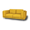
If you specifically look at Kivik, you can covers for different Kivik models compare to make the sofa blend more calmly with your interior.

A large piece of furniture calls for soft choices
With a small cushion, you can more easily experiment with bright colors or bold patterns. It works differently with a large sofa. Everything you choose immediately becomes a large surface in the room. That's why soft colors, matte fabrics, and subtle textures are often safer when you want more calm.
A calm fabric works well in those situations because it doesn't have to be completely flat visually, but it also doesn't look busy. A light texture adds depth without needing a striking pattern.
Rust arises from less harsh contrasts
A busy interior often doesn’t come from one object, but from too many contrasts at once. A dark sofa against a light wall, a bright rug, shiny furniture, many small accessories, and harsh window treatments can together create a lot of visual stimuli.
A calm cover can help soften one large surface. That doesn’t solve everything, but it makes the base of the seating area feel lighter. After that, you can more easily coordinate accessories, curtains, and colors.
Calm texture is more important than the material name
It’s tempting to focus mainly on material names. Linen, cotton, boucle, chenille, or velvet all sound different and immediately evoke a certain atmosphere. Still, the name alone doesn’t say enough. The exact composition, thickness, weave, and finish determine how a fabric really feels and behaves.
For a calm living room, it’s smarter to look at the overall effect. How does the cover fall on the sofa? Does the fabric look matte or shiny? Does the texture have enough depth without being busy? Does the color match the floor, curtains, and walls?

Why subtle texture gives more calm than a flat fabric
A completely smooth fabric can look sleek, but in a busy interior it can sometimes feel harsh or formal. A subtle weave or soft texture breaks the light in a calmer way. This makes the sofa appear less flat and less bulky.
That doesn’t mean the cover can be sloppy. Fit remains important. But a light drape, matte look, or soft texture can help make a living room feel more inviting and less strict.
Don’t choose fabric based on appearance alone
A fabric should not only be beautiful but also suit how the sofa is used. Always check product information, fabric properties, and care advice for the specific cover.
For a calm interior, it’s not about one perfect fabric name. It’s about color, texture, fit, light, and daily use together.
From heavy sofa to calmer centerpiece
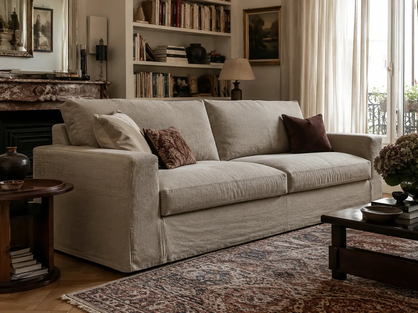
A wide sofa can be wonderfully comfortable, but in some rooms it can also look heavy. This especially happens when the fabric is dark, flat, or strongly contrasting with the rest of the interior.
A calm cover does not change the shape of the sofa, but it does change how that shape is perceived. A matte, softer fabric can make large surfaces appear less harsh. A warm neutral color can help the sofa blend more into the room.
Light and warm tones soften the sofa
Light shades like sand, warm beige, off-white, greige, or soft taupe can make a large sofa look airier. They reflect more light than dark shades and often match well with wooden floors, light walls, and natural curtains.
The undertone is important here. Cool white can be fresh but also harsh. Warm white, natural, sand, or greige usually feels softer and more livable. For a minimalist look, you don’t have to make everything white. A warm neutral palette brings calm without making the room sterile.
Dark can also be calm
Calm doesn’t automatically mean light. A dark cover can actually feel very calm if the color is muted and the rest of the room has enough airiness. Think warm gray, olive green, dark taupe, or a soft brown tone.
The difference lies in contrast. A dark sofa against a very light, bare wall can stand out harshly. But the same sofa with soft curtains, a warm rug, and wooden accents can feel cozy and calm.

Less visual noise through repetition
Calm in an interior doesn’t come only from having fewer things. Repetition also plays a big role. When colors and materials appear in different places, the room feels more cohesive.
A calm cover works well when you subtly repeat the same atmosphere in curtains, cushions, or a rug. Not exactly the same material, but the same calm line.
Ton sur ton without becoming boring
Ton sur ton means combining different shades within the same color family. Think of a sand-colored sofa, cream curtains, a warm gray rug, and cushions in taupe or natural tones.
This can quickly look calm and mature, as long as you keep enough variation in texture. For example, combine a matte cover with a coarser woven cushion, a soft throw, or a rug with subtle texture.
Limit the number of striking accents
A busy interior often has too many accents all demanding attention. Instead, choose one or two clear accents and keep the rest calm. A dark wood coffee table, a ceramic vase, or a single artwork can be enough.
The sofa doesn’t have to steal the show. It forms the calm base around which the rest of the room can work.

Window coverings soften the seating area
Window coverings have a big influence on how sofa, floor, and walls come together. Curtains determine how light enters the room and how soft the seating area feels.
If you want to continue a natural line, suitable linen curtains good with a calm sofa cover. The materials don’t have to be exactly the same. It’s mainly about the shared atmosphere: matte, soft, natural, and not too busy.
Window decoration without unnecessary lines
In a busy interior, calm curtains often work better than hard lines, strong patterns, or heavy contrasts. Especially when the sofa is close to the window, you often see the sofa and window coverings together. Then they need to visually support each other.
If you want to go deeper into this, an internal reference to minimalist window coverings fits better than a long explanation in this text. This blog can specifically focus on windows, light filtering, and privacy, while this guide focuses on the sofa as the largest surface in the seating area.
Practical advantages of a calm cover
A calm appearance is important, but a living room must also remain practical. A cover that looks nice but causes a lot of stress with every stain ultimately brings little peace. That’s why when choosing a calm cover, you should look not only at color and texture but also at maintenance.
Removable covers can be handy, especially when the sofa is used daily. Always follow the care label of the specific fabric. Not every cover has the same composition or can be washed in the same way.
A cover must suit your household
If you have children, pets, or many guests, a medium-light or mixed fabric is often more practical than a completely white cover. Small stains, lint, or light signs of use are then less noticeable.
If you mainly use the sofa calmly, you can more easily choose a lighter shade or a more delicate look. The best choice therefore depends not only on what looks good but also on how you live.
Renew without replacing the entire sofa
A new cover can give a sofa a completely different look without replacing the furniture itself. This is especially interesting when the base of the sofa is still good, but the color or fabric no longer fits your interior.
If you have multiple IKEA models at home or want to compare more broadly, you can look at handmade sofa covers for IKEA modelsThat helps to coordinate the seating area as a whole more calmly, instead of just looking at one sofa separately.
How to make a busy interior calmer with one sofa cover
A sofa cover is not a miracle cure, but it can be a good starting point. Because the sofa forms such a large surface, a change there often has more effect than replacing small accessories.
A practical approach:
- First choose a calm base color for the sofa.
- Repeat the color or undertone in curtains, cushions, or rugs.
- Limit bright accents to one or two spots.
- Use texture instead of busy patterns.
- Make sure the cover fits well and falls neatly.
These steps work especially well when your interior isn’t necessarily too full, but gives too many different signals. By calming one large surface, the whole seating area often feels more balanced.
Frequently Asked Questions
Which cover makes a busy interior calmer?
A cover in a calm color with a subtle texture often works best. Think of warm neutral tones, soft greige, sand, taupe, or a light mixed fabric. The goal is for the sofa to stand out less sharply against the rest of the room.
Which color gives the most calm in a busy interior?
Warm neutral colors like sand, greige, taupe, off-white, and warm beige often work well. They are calmer than bright colors and less harsh than cool white.
Is texture more important than color?
Both are important, but texture strongly determines how soft or hard a sofa looks. A subtle weave or matte fabric can make a large sofa calmer, even when the color is quite simple.
Should window decoration match the cover?
No, exact matching is not necessary. It’s better if the colors and materials are in the same mood. This creates harmony without the room becoming too perfect or flat.
How do you prevent a minimalist interior from feeling cold?
Use warm neutral colors, soft fabrics, and some natural materials like wood, wool, or ceramics. This keeps the space calm without feeling empty or harsh.
Conclusion
A calm cover can bring a lot of balance to a busy interior, especially because the sofa takes up such a large visual surface. By choosing a soft texture, warm color, and good fit, the sofa becomes less dominant and more a part of the space.
The biggest gain is not in one perfect fabric, but in harmony. When the cover, curtains, floor, and accessories quietly support each other, visual noise decreases. This way, the living room doesn’t feel empty or harsh, but lighter, softer, and better balanced.