


A large sofa immediately sets the mood of a living room. The color is not just a detail but one of the biggest visual choices in the space. A small color change on a cushion stands out, but a new color on a large sofa changes the whole room.
That’s why it’s smart not to follow trend colors blindly. A color can look beautiful in a photo but feel too heavy, too cool, or too busy in your own living room. Especially with a large sofa, you need to consider light, floor, walls, curtains, existing furniture, and how intensively the sofa is used.
The interior colors of 2026 clearly move towards warmth, depth, and personality. Cool gray and stark white don’t disappear completely but are increasingly replaced by earth tones, soft neutral colors, deep greens, calm blues, and richer browns. For large sofas, that’s good news. These colors create atmosphere without the sofa immediately needing to be loud.
In this guide, you’ll read which color families work best on a large sofa in 2026, how to combine them, and when it’s better to choose a calmer variant.
Why color works differently on a large sofa
A large sofa is a color surface. That sounds technical, but it’s important. A fabric sample of ten centimeters can seem subtle, while the same color on a wide corner sofa is much more present. The larger the surface, the more influence the color has on the space.
That’s why you can better judge a sofa color as part of the whole room. A terracotta cover can be warm and stylish in a bright living room but may feel too heavy in a small dark space. A dark blue sofa can be elegant and calm but requires the right balance with the floor, walls, and lighting.
Large sofas call for nuance
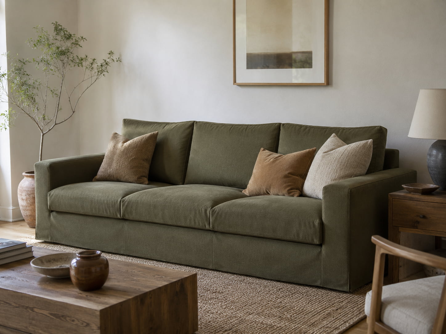
With a large sofa, nuance often works better than extreme color. That doesn’t mean you can only choose beige or gray. It means the color must have depth. Think olive green instead of bright green, midnight blue instead of bright royal blue, rust brown instead of bright orange, and warm taupe instead of cool gray.
These colors are clearly present but remain livable. They suit everyday use better and are easier to combine with wood, rugs, curtains, and accessories.
The fabric changes how the color looks
The same color can look very different in various fabrics. A matte woven fabric makes a color calmer. Velvet adds more depth and play of light. Bouclé or another textured fabric makes the color softer and more tactile. Corduroy can make a color feel more casual and warmer.
That’s why you shouldn’t just ask: what color do I want? You should also ask: in which fabric does this color work best on my sofa?
Trend 1: warm earth tones remain strong
Earth tones are not new, but in 2026 they become deeper and richer. While previous years focused a lot on light beige and greige, we now see more warmth: terracotta, clay, rust, caramel, warm brown, taupe, and soft sand tones.
For large sofas, these are strong choices because they add atmosphere without harsh contrast. They feel natural, calm, and mature. A large sofa in a warm earth tone can immediately soften the living room, especially if the rest of the space contains lots of wood, ceramics, linen look, or natural materials.

Terracotta and clay for warmth
Terracotta and clay tones work well when your living room could use more character. They go nicely with light walls, wooden floors, black accents, and natural curtains. On a large sofa, you need to watch that the color doesn’t become too orange. A muted terracotta or rust brown shade is often easier than a bright orange tone.
These colors work especially well in rooms with plenty of daylight. In a dark room, they can be cozy but also quickly feel heavy. Then combine them with light cushions, a beige rug, or a soft wall color.
Taupe and warm brown as mature neutrals
Taupe and warm brown are handy if you want warmth but no strong color. They are less harsh than black and less cool than gray. On a large sofa, they can work surprisingly calmly, especially in an interior with natural materials.
A warm brown sofa doesn’t have to be old-fashioned. The choice of fabric makes a big difference. In a matte fabric, brown looks calm and earthy. In a richer texture, it gains more depth. Combine with off-white, dark wood, brass, or soft green tones for a mature look.
Trend 2: green becomes deeper and more mature
Green remains important in 2026, but the most interesting shades are less fresh and more layered. Think of olive green, moss green, forest green, gray-green, and deep blue-green tones. These colors fit well with the desire for natural, calm interiors.
For a large sofa, green often works better than people expect. It feels like color but stays close to nature. This makes it easy to combine with wood, plants, wool, stone, ceramics, and warm neutral tones.
Olive green for a calm base
Olive green is one of the most versatile green shades for a large sofa. It is less striking than emerald green and warmer than many gray-green tones. This makes it work well in both modern and more classic interiors.
An olive green sofa looks beautiful with light walls, natural wood, and cream-colored accessories. Want more depth? Then combine it with dark wood, bronze details, or a rug in warm earth tones.
Deep green as a statement without brightness
Deep green can give a large sofa a clear role in the room. It’s a statement but not loud. Especially in velvet or a soft, rich fabric, the color gains a lot of depth.
Pay attention to the rest of the space. A large deep green sofa needs breathing room. Keep walls, floors, or curtains calmer if you want to avoid the room feeling too heavy. In a larger living room, deep green can actually provide a pleasant anchor point.

Trend 3: dark blue remains a safe color with character
Blue is one of the most timeless choices for a sofa. In 2026, it’s less about bright blue and more about deeper, calmer shades: navy blue, smoky blue, blue-gray, and dark denim blue.
A dark blue sofa is interesting because it adds color without creating chaos. It often feels calmer than green or terracotta but less predictable than gray. That makes it a good choice for people who want color but are afraid they’ll tire of it.
When dark blue works well
Dark blue works well with light walls, wooden floors, brass details, natural stone, beige curtains, and soft gray tones. It can also look beautiful in a more classic interior with dark wood and warm lighting.
In a small space, dark blue can work surprisingly well, as long as the rest of the room isn’t heavy too. Keep the rug, walls, and larger accessories lighter. This way, the sofa remains clearly present but doesn’t feel massive.
If you’re unsure about a dark blue sofa, here’s a natural reference for it Don’t be afraid of a dark blue sofaYou can go deeper into combinations, light, and balance there.

Trend 4: new neutral colors are getting warmer
Neutral sofas remain popular, but the cool gray sofa is facing more competition. In 2026, neutral colors feel softer and warmer. Think sand, cream, warm beige, greige, peige, taupe, and light clay bronze.
These are safe choices for a large sofa, but they don’t have to be boring. The key lies in undertone and texture. A warm beige with a pink or clay undertone feels different from a cool beige. Greige can look warm in some rooms and more neutral in others. That’s why testing in daylight is important.
Why texture is important with neutral colors
With a neutral sofa, the fabric stands out more. If the color is calm, the texture needs to add depth. A bouclé, linen look, chenille, or mixed weave can prevent a large neutral sofa from looking flat.
Pay attention to practical use. A very light sofa can be beautiful but requires more care in a household with children or pets. A medium-light shade like taupe, sand, or warm greige is often more forgiving.
Neutral doesn’t mean colorless
A neutral sofa doesn’t have to be white, gray, or beige without character. Warm neutral tones can actually add a lot of atmosphere. They form a calm base on which you can later add more color with cushions, throws, art, or curtains.
That makes them strong for people who like to update their interior from time to time. The sofa remains the base, while accessories can more easily change with trends.

Trend 5: reddish-brown and burgundy tones are making a comeback
Besides earth tones, we also see more interest in deep reddish-brown colors. Think of burgundy, aubergine, oxblood, wine red, and brown plum tones. These aren’t easy colors, but on a large sofa, they can be very strong if the rest of the room stays calm.
These tones suit interiors with personality. They work beautifully alongside dark wood, vintage furniture, ceramics, soft lighting, and art. They give a large sofa a richer, more distinctive look.
Burgundy and plum tones with warm materials
Burgundy tones work best when you don’t combine them too coolly. Think of dark walnut wood, cream walls, warm brass, smoked glass, soft wool, and art with earthy colors. This way, the sofa doesn’t become a separate color block but part of a warmer whole.
A deep reddish-brown sofa can also look beautiful in an interior with vintage influences. For example, combine it with a dark wooden coffee table, a light rug, and calm curtains. Then the color feels distinctive but not heavy.
When to use these colors more subtly
Not every room can carry a large burgundy sofa. In a small or dark space, the color can feel heavy. Then it’s better to use this trend in cushions, an armchair, a throw, or a smaller piece of furniture.
If you have a spacious living room with lots of light, a deep reddish-brown sofa can look very mature and warm. Pair it with calm walls and few bright accents so the color has enough space.
How to choose the right trend color for your sofa
Choosing a trend color doesn’t start with the trend itself, but with your room. What works on Pinterest or in a showroom doesn’t automatically work in your living room. So first look at the fixed elements that you won’t change quickly.
The floor, wall, light exposure, and large furniture determine how much freedom you have. A sofa cover is easier to replace than a floor, but the new color must work with that floor.
Look at the light exposure
Light changes the color. A north-facing room often has cooler light. Warm tones like terracotta, taupe, sand, and olive green can bring balance there. A south-facing room often has warmer light. There, blue-gray, deep green, or cooler neutral tones can work beautifully.
Always view a fabric sample at different times of the day. Morning light, midday light, and evening light can make the same fabric look very different.
Pay attention to the floor
The floor is a large color surface. A wooden floor with an orange undertone calls for different sofa colors than a light oak floor or a gray tile floor. Warm floors often combine well with greens, taupe, cream, and deep blue tones. With very yellow or orange floors, be careful with too much terracotta, as the room can become too warm.
Always place fabric samples on or next to the floor. Not just against the wall. Visually, the sofa is closer to the floor than to the wall.
Consider size and proportion
The bigger the sofa, the calmer the color usually needs to be. That doesn't mean lighter, but more nuanced. A deep color with a muted undertone often works better than a bright color.
With a small sofa, you can experiment more easily. With a large corner sofa or wide 3-seater sofa, the color is much more dominant. Then it's better to choose a shade you will still enjoy looking at in three years.

Choosing color for Kivik and other IKEA models
Kivik has a wide, low, and sturdy shape. Because of this, colors can work differently on it than on a narrower or taller sofa. A light color can make Kivik feel airier. A dark color can give the sofa more weight and calm. A textured fabric can soften the broad surfaces.
If you specifically want to tailor Kivik to your interior again, you can look at new colors for your Kivik cover. This is especially suitable when your existing Kivik is still in good condition, but the current color no longer matches your living room.
For those who look beyond just Kivik, handmade sofa covers for IKEA models more logical. This is especially useful if you have multiple IKEA models at home or want to compare which sofa cover fits your model and living style best first.
Which fabrics enhance trend colors
Color and fabric cannot be seen separately. A trend color can look chic in one fabric and flat or busy in another. Especially with a large sofa, the choice of fabric is just as important as the color.
Velvet for depth
Velvet gives color more depth through the way it catches the light. Dark blue, deep green, burgundy, and warm brown can look richer in velvet than in a flat fabric. This works well if you want the sofa to have a clearer role in the room.
Velvet does require balance. Combine it with matte materials like wood, wool, ceramics, or linen look, so the room doesn’t become too shiny.
Bouclé and chenille for softness
Bouclé in chenille can make a color feel softer. Especially with large sofas, a tactile fabric helps to make the color surface less harsh. This is useful with warm neutral tones, soft greens, and earthy colors.
Read more about natural and soft fabric looks in the difference between cotton and linen looks.
Corduroy for warmth and texture
Corduroy gives a sofa a more informal, warmer look. For trend colors, it’s especially important that the ribs break the light, making earth tones and greens look less flat.
If you’re unsure between a softer or a more pronounced fabric, you can read more about corduroy or velvet for a more luxurious sofa.
How accessories support the sofa color
A sofa color works better when the rest of the room supports that color. That doesn’t mean everything has to match. A little difference actually makes the interior more lively.
Ton-sur-ton for calm
Ton-sur-ton means combining different shades within the same color family. With a taupe sofa, you can work with cream, sand, warm gray, and light brown. With a green sofa, you can combine moss green, olive, beige, and natural wood.
This works well when you want a calm living room. It prevents a large sofa from feeling disconnected from the rest of the space.
Contrast for character
If you want more tension, use controlled contrast. A dark blue sofa can look beautiful with brass, warm wood, and cream-colored cushions. A terracotta sofa can work well with olive green, off-white, or dark wood.
Prefer contrast in a few clear accents rather than everywhere at once. This keeps the room mature and calm.
Rug and curtains as a connecting layer
A rug can connect the sofa with the coffee table and armchairs. Curtains determine the softness and light filtering of the room. Together, they can make a large sofa feel less isolated in the space.
A lighter rug often works well with a dark sofa. With a light sofa, a rug with a bit more depth or pattern can strengthen the seating area.
The main mistakes with trend colors on large sofas
Trend colors can refresh your living room, but there are also pitfalls. The biggest mistake is choosing based on one beautiful photo. A photo does not show your light, your floor, or your daily use.
A second mistake is combining too many trends at once. A deep green sofa, a bright rug, a striking wall, and many different accessories can become too busy together. Preferably choose one main element and build around it.
A third mistake is forgetting how big the sofa is. A color that looks beautiful on an armchair can be too dominant on a large corner sofa. Always test with fabric samples and view the color at different times of the day.
Frequently Asked Questions
Which sofa color is the most timeless in 2026?
Warm neutral colors like taupe, sand, greige, and warm beige are probably the most timeless. They fit many living styles and can easily be adjusted with accessories.
Is dark blue suitable for a large sofa?
Yes, dark blue can work very well on a large sofa. It adds color without becoming too bright. Just make sure there is enough contrast with lighter walls, rugs, or accessories.
Which color works well in a family with children?
Midtones are often practical. Think of taupe, warm gray, olive green, sand, or mixed fabrics. Very light shades show stains more quickly, while very dark shades can make fabric and hairs more visible.
Should I choose a trend color or a neutral base?
That depends on how often you want to change your interior. If you like to switch accessories, a neutral sofa is handy. If you want the sofa itself to create atmosphere, a deep trend color like olive green, night blue, or terracotta can work well.
How do I test a color before choosing a cover?
Look at fabric samples in your own living room. Place them by the floor, against the sofa, and next to the curtains. This way, you can better see how the color really works in your space.
Conclusion
The trend colors of 2026 are especially interesting because they can make large sofas softer, warmer, and more personal. Earth tones, deep greens, calm blues, warm neutral colors, and reddish-brown accents fit well with the broader living trends around comfort, texture, and character.
Still, the best color always depends on your own room. Look at the light, floor, size of the sofa, fabric texture, and daily use. A trend color is only successful if it not only looks good in a photo but also feels logical in your own living room.
If your existing IKEA sofa is still in good condition, a new cover can be a smart way to experiment with color without immediately buying a completely new piece of furniture. This way, your living room gets a fresh direction while the base remains familiar.